 Done in the project
The website is the business card of the company
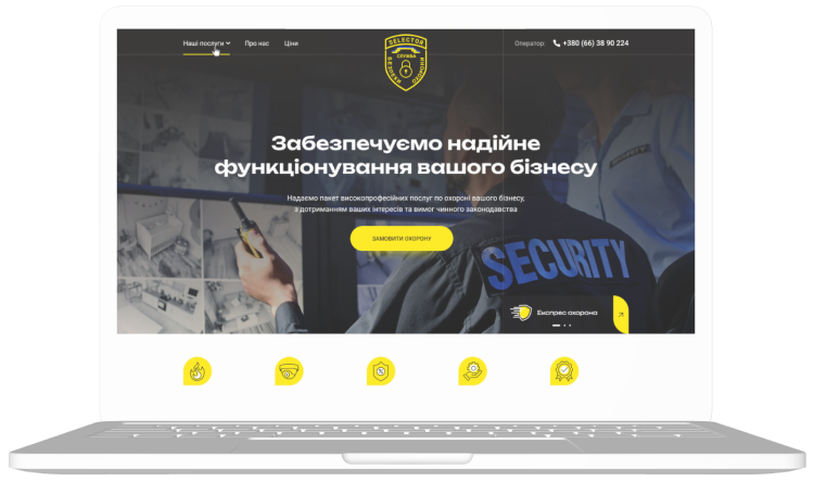 We present a ready-made solution – a concise and, at the same time, informative site and a business card for the company on the Internet.
Ease of use and brand positioning have already been built into the site during design and development. Clear white letters on a dark background convince the user of a sense of security with the company. The yellow color carries the comfort and warmth of the sun and accompanies the visitors in combination with the pure white color. In the combination with such a color scheme, the designer emphasizes that the company is trustworthy. In turn, we made the logo in the form of a shield, which associates the company with the protection of its customers. A ribbon in patriotic colors speaks of steadfast patriotism and care for the citizens of our country. At the heart of the logo is a castle – as a symbol of the reliability of both residential and commercial premises for customers.
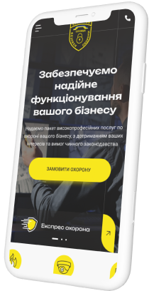 During the design and development of the site, elements for further promotion (SEO) and the user experience of the site were immediately taken into account.
Company business card site functionality
- Communication. From the first screen, website visitors can easily clarify the details of cooperation or immediately order security. If necessary, you can contact a security operator with one touch.
- Feedback form. On each page, a feedback form is available in an open form or by clicking on a button with an appeal. With this approach, the attention of the site visitor is not lost and, he can easily contact the operator on the hotline at any time while viewing the page.
- The main thing is immediately. At a glance, the types of security services provided by the company are available. For convenience, you can familiarize yourself with them in more detail with one click.
Main page
The main page always serves as the face of the site and the company in the Internet space. The site, its design and user familiarity begin with it. Advantages of the main page of the business card website for the company.
- Focus on the main thing. On the first screen, there is a slider with the company’s services. There is a need for users to apply or learn more in detail at the first glance.
- Saving time. The site loads instantly, and it’s easy to get in touch with just one touch to solve an urgent issue.
- Gradual familiarization. After the first screen, the site gradually introduces the services, but with short and concise characteristics. The user receives a little more detailed information to focus on the solution to his problem or question.
- Spacious design. We designed the site responsively, each element has its place, enough space around it, and quality for a detailed study.
- Functional basement of the site. Even after scrolling to the bottom of the site (basement of the site, footer), the visitor has the opportunity to:
- call the hotline number or clarify information about security;
- send a letter by mail;
- get acquainted with the services and additional information about the company.
- Convenience and compactness. Using only one form, we provide an opportunity for potential customers to contact the service by phone, Viber or Telegram.
You can view the site by following the link – https://business-card.selector.space/.
Main services
Site development
Balance between power and appearance of a business tool
Promotion (SEO)
It is your products and services that will be in the TOP results of search engines.
crm, Retail, project, ERP
All business processes must work clearly and efficiently.
Copywriting
We write texts that sell: for websites, landing pages, email newsletters, and advertising.
Design
A unique design will set your business apart from your competitors
